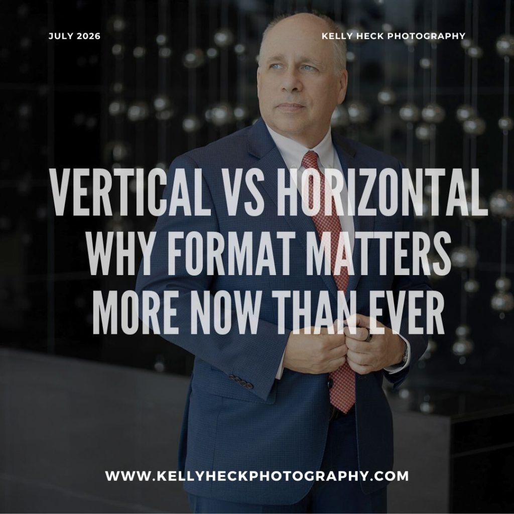
Your orientation determines your visibility, engagement, and conversions.
Introduction: Orientation Is Now a Strategic Decision (Not a Style Choice)
Once upon a time, photos were horizontal by default.
Websites were horizontal.
Print was horizontal.
Presentations were horizontal.
And then… the smartphone became the world’s primary viewing device.
Today:
- More than 82% of digital content is consumed on mobile
- Vertical formats dominate social reach
- Platforms reward vertical content with more visibility
- Users scroll vertically, not horizontally
- Websites must work in both formats
If your brand isn’t intentionally planning vertical and horizontal images, your content is already underperforming.
Let’s break down the differences, the strategic uses, and how to make sure you always have the right format ready.
1. When to Use Vertical Images (9:16)
Vertical = attention + engagement.
Vertical visuals rule 2026 because they fill the entire mobile screen — creating a more immersive experience.
Use vertical photography for:
✔ Instagram Reels
✔ TikTok
✔ YouTube Shorts
✔ LinkedIn vertical posts
✔ Pinterest Idea Pins
✔ Facebook Reels
✔ Mobile landing pages
✔ Vertical website sections
✔ Email banners on mobile
✔ Story-style ads
✔ Mobile hero images (growing trend)
Verticals feel modern, personal, and native to the way people consume content.
Why vertical works so well:
- Takes up more screen real estate
- Stops the scroll
- Matches how people naturally hold their phones
- Provides better face/subject visibility
- Adds variety to your visual marketing
- Makes your brand look current & tech-aware
If your current photo library is mostly horizontal, you’re missing huge mobile opportunities.
➡ For vertical inspiration, browse my Brand Photography Portfolio — most sessions now include intentional verticals.
2. When to Use Horizontal Images (16:9 or 4:3)
Horizontal = clarity + professionalism.
Despite the rise of vertical content, horizontal photography is STILL essential — especially for places where clarity and structure matter most.
Use horizontal photography for:
✔ Website homepage hero banners
✔ About pages
✔ Team photos
✔ Blog headers
✔ Presentation slides
✔ Email headers
✔ Print marketing
✔ Product detail pages
✔ “Wide” environmental portraits
Horizontal is ideal for any space where you need:
- Text overlays
- Negative space
- Clean layouts
- Professional, structured design
Why horizontal still matters:
- Most websites are designed around horizontal elements
- Banner images simply look better wide
- Designers often need “breathing room” on the edges
- Horizontal orientation supports storytelling and context
The best brands use horizontal images as their foundational visual structure.
➡ You can see great horizontal examples in my Headshot + Team Portfolio.
3. When to Use Square Images (1:1)
Square = versatility.
Although less dominant than vertical, square is still a workhorse.
Use square images for:
✔ Instagram feed posts
✔ Grid-style galleries
✔ Product listings
✔ Email graphics
✔ Ads where cropping is unpredictable
✔ Website grid sections
Squares are simple, balanced, and easy to plug in anywhere. Many businesses underutilize them.
4. Why You Need BOTH Vertical and Horizontal (This Is Where Most Businesses Mess Up)
Most businesses rely heavily on horizontal images, simply because that’s what photographers defaulted to for decades.
But here’s the truth:
If you want to maximize your investment, you need BOTH orientations built into every brand session.
When you only have horizontals:
- Reels and TikToks look cropped or awkward
- Stories look unprofessional
- Mobile site layouts suffer
- You miss platform-specific opportunities
When you only have verticals:
- Website banners become unusable
- Blog headers look wrong
- Presentations fall apart
- Printed materials feel cramped
The real ROI? A dual-orientation shot list.
I plan this with all my business clients so you walk away with:
✔ Website-ready horizontals
✔ Social-ready verticals
✔ Square options for grid consistency
✔ Negative-space-friendly shots
✔ Banner-friendly images
✔ Full-lifestyle mid-frame shots
This dramatically increases how long your images stay useful — and how many places you can use them.
5. How Format Impacts Your Marketing (The Numbers Don’t Lie)
Vertical images get:
- Up to 3x more reach on social
- Up to 40% stronger engagement
- Higher full-screen retention on Reels/Stories
- Better ad performance on mobile
Horizontal images get:
- Better website conversions
- Better readability for text overlays
- More polished branding
- Stronger professional presence
Square images get:
- Consistent grid views
- Clean product displays
- Predictable cropping
Orientation is no longer a creative preference — it’s a strategic marketing tool.
6. How to Make Sure Your Next Photoshoot Covers All Your Orientation Needs
✔ Step 1: Identify the platforms you use
Website? Social? Ads? Email?
✔ Step 2: Note the crop requirements for each
This affects how I frame the shot.
✔ Step 3: Build a dual-orientation shot list
One shot captured both ways = double the usability.
✔ Step 4: Leave room for text
Negative space is a huge part of orientation planning.
✔ Step 5: Capture “safe zone” compositions
This ensures nothing important gets cut off in awkward crops.
This entire process is built into my Photography Consulting Program so businesses walk away with a ready-to-use, multi-platform photo library.
Ready to Get More Out of Every Photo You Create?
If you want a photo library filled with vertical AND horizontal images — all shot intentionally for your website, social media, and marketing — I’d love to help you plan your next session.
👉 Contact KHP: https://www.kellyheckphotography.com/contact/
Let’s build you visuals that work everywhere your brand shows up.